
Role
User Research
Product Strategy
UI Design
Interaction Design
Usability Testing
Tools
Figjam
Notion
Maze
Figma
Otter
Timeline
5 weeks
Users seeking to take advantage of the benefits of cold water exposure feel confused and overwhelmed with the 20-Day Cold Shower Challenge segment. This results in users abandoning the challenge before experiencing the health benefits, and a decrease in the rate of new users converting from a free to a premium paid plan.
The Solution
By clarifying the primary action on the home page and simplifying the steps in the user flow, users are able to move from the home page to their first shower efficiently making them feel at ease as they build a new healthy habit. Additionally, options to set reminders and write journal entries make users feel motivated and invested in the challenge. This results in an increase of users completing the challenge, experiencing the health benefits, and converting to a premium paid plan.

Usability Review
To begin we conducted a usability review and identified pain points and wow moments in the existing product. Our main goal with this step was to empathize with new users— focusing on the new user sign-up process and the 20-Day challenge segment. To really put ourselves in users' shoes, we even dove into the challenge ourselves starting with 20 days of cold showers!
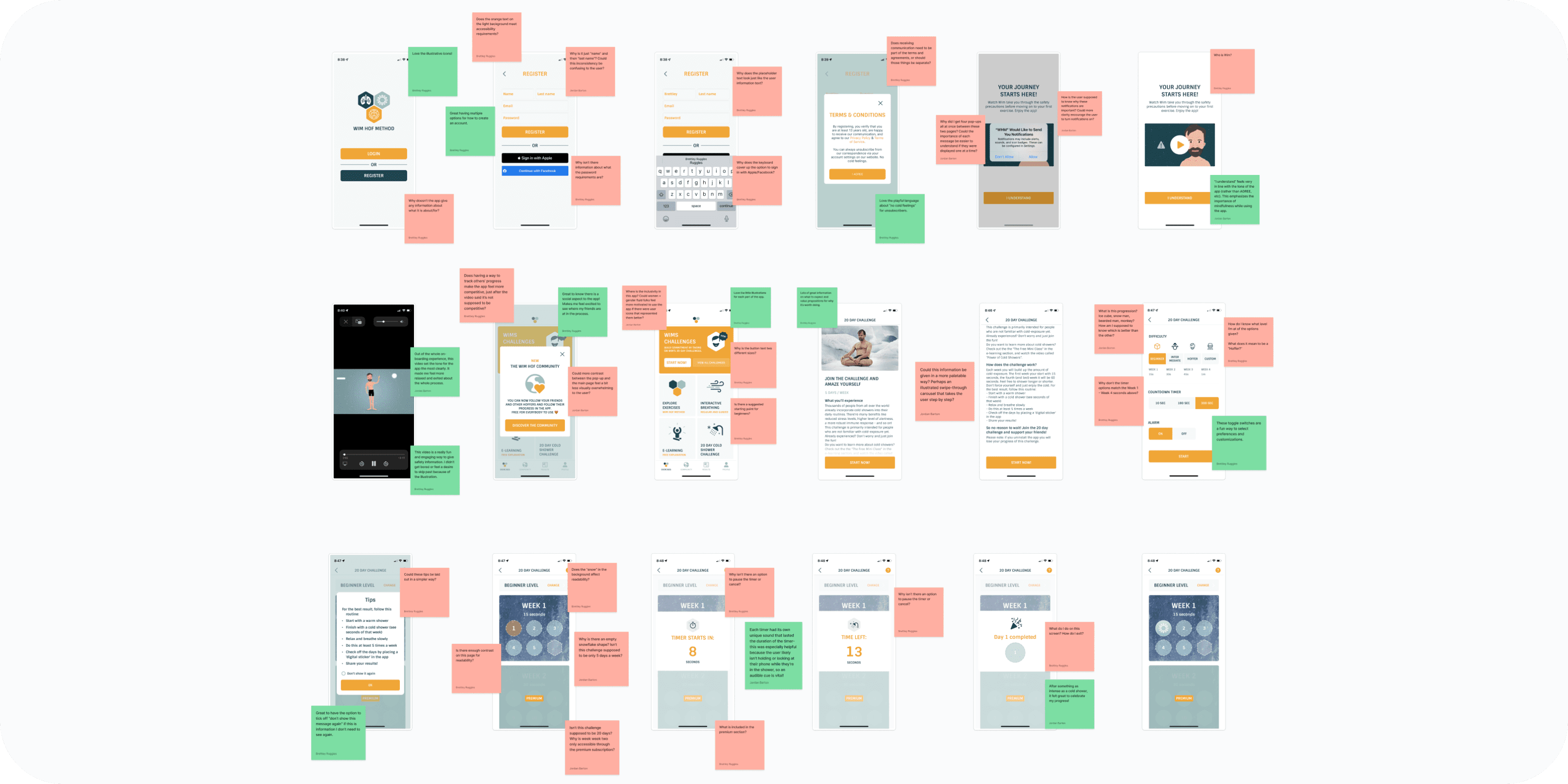
Business & User frustrations
With pain points and wow moments highlighted and a look at how competitors were tackling the same problems, we synthesized the data to define one primary and one secondary frustration.
Primary Frustration
When beginning the Cold Water Shower Challenge users are confused and overwhelmed which results in abandoning the challenge before finishing.
Secondary Frustration
When interacting with the timer and settings pages users are frustrated and confused which results in a failure to see the value/benefit of the product.
Competitor Benchmarking
With a usability review complete, we moved on to competitor benchmarking to identify standards and solutions from both indirect and direct competitors that might be used to improve the existing experience. We focused on five key metrics to help draw unique comparisons and insights from each competitor: learnability, efficiency, memorability, errors, and satisfaction.


Problem Space
Following our research we jumped in to define the problem space to help us better focus our energy on a potential solution for users and business.
We found new and returning users seeking to take advantage of the benefits of cold water exposure may feel confused and overwhelmed with the 20 Day Cold Shower segment. From the Home Page it is unclear where to begin. Inside the challenge there are too many steps before beginning the first shower. The settings and timer pages do not provide enough guidance. It's important for users to feel at ease within the challenge so they feel confident while learning a new habit, experience the health benefits, and ultimately, develop a value for what the product offers.
How Might We… make it easier for users to complete their first cold shower?
Ideation
To explore ideas collaboratively we conducted a series of ideation techniques. We started with “Crazy 8’s” using time as a constraint to generate quick, judgment-free ideas. We then built a mind map to expand on those ideas and differentiate between which ideas were improvements and which would be additions.


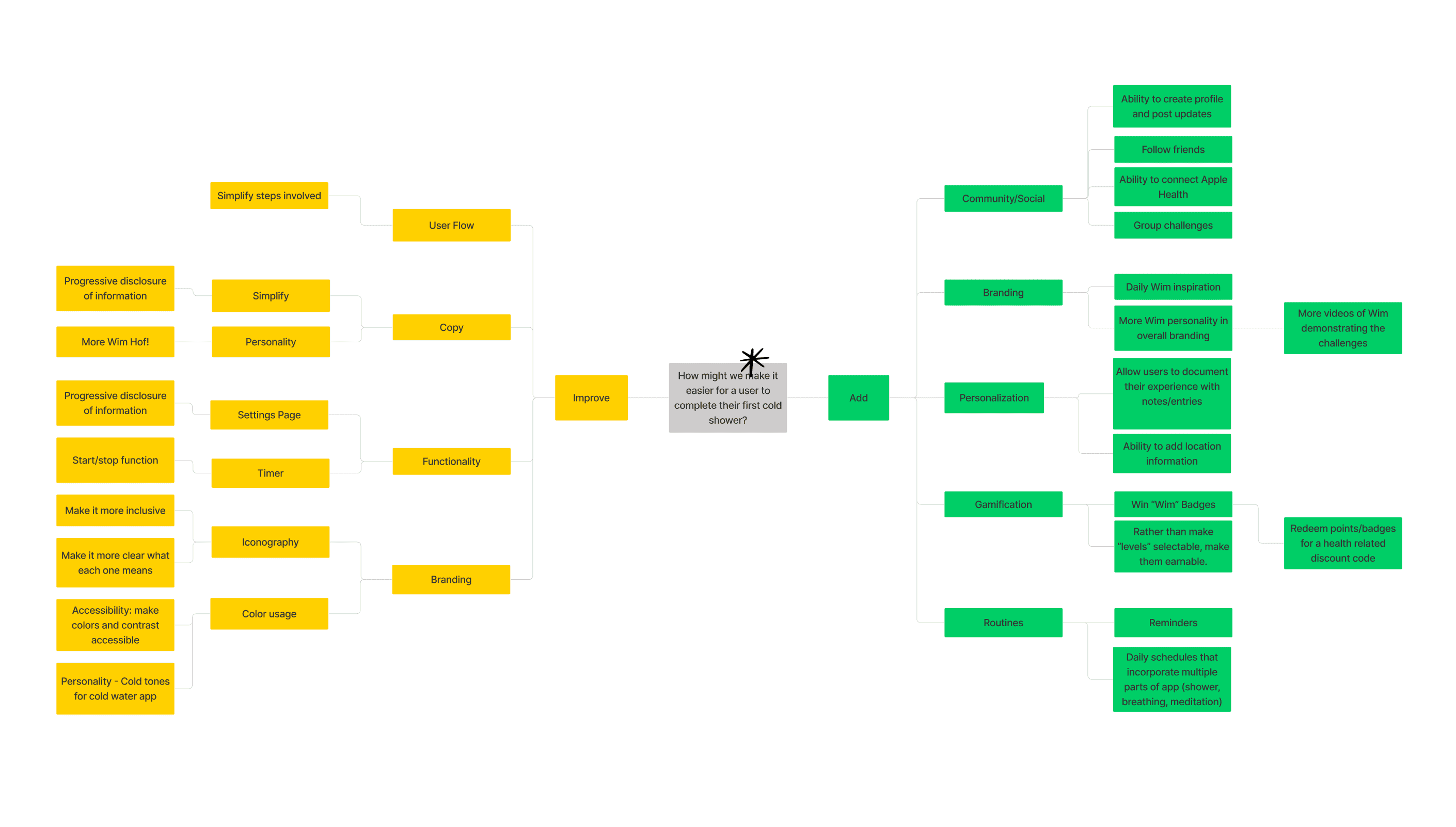
What can we add
We determined the highest priority idea we could add was the option for users to set a reminder for their next shower.
What can we improve
The highest priority idea that we identified we could improve was simplifying the user flow between selecting the challenge on the Home Page and starting the first shower.
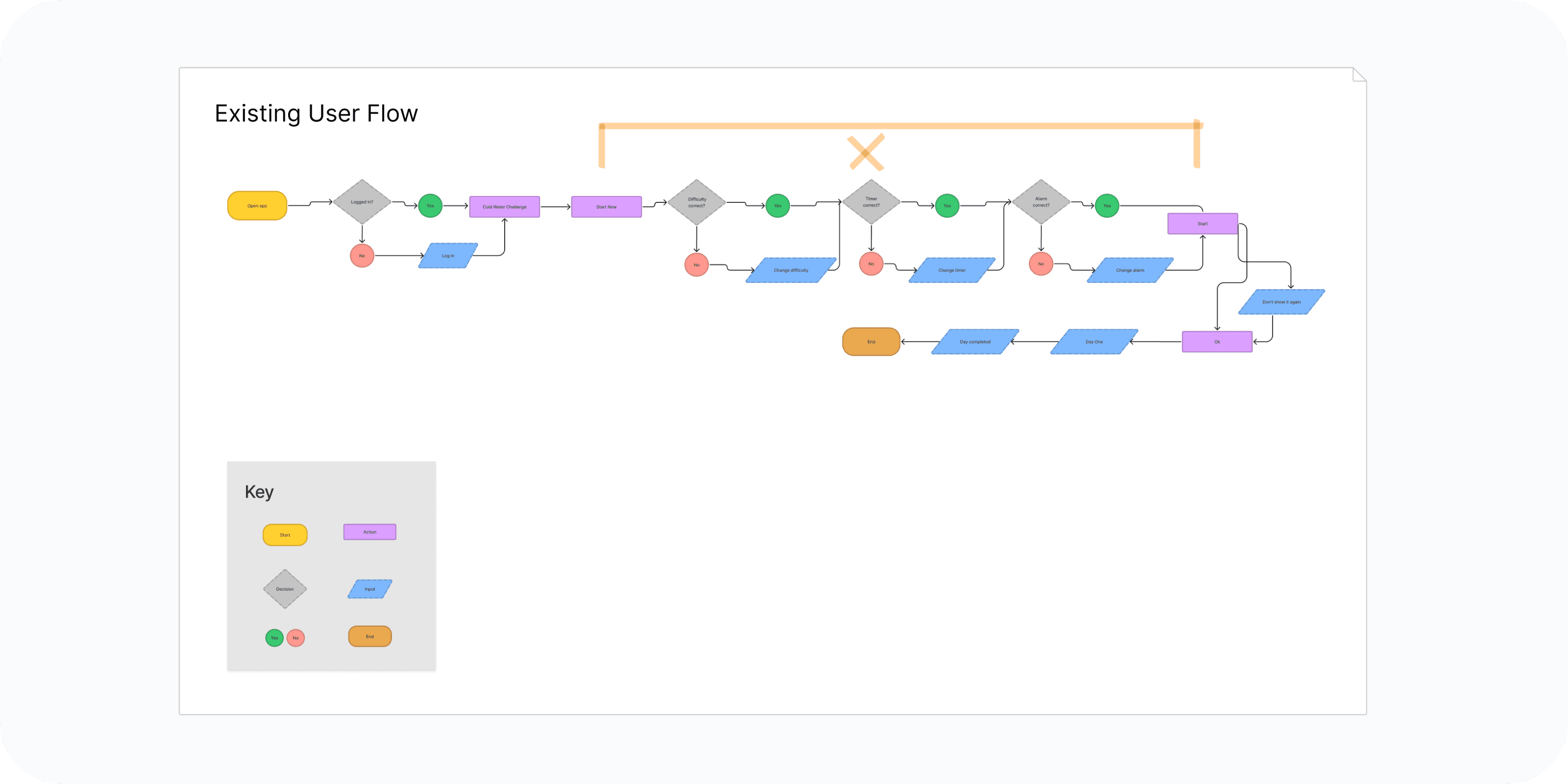
User Flows
Following Ideation we created user flows of the existing experience and improved the flow based on the ideas we selected which fit with business and user goals.
Our key improvement is in minimizing the actions needed from Home Screen to Timer page. Our secondary improvement is in progressive disclosure of information through a concise Instruction Carousel and post-shower pages.
We chose not to add an option for converting to premium until the end of the challenge as it will give users the opportunity to experience the value and benefit of the app before declining to pay for it.

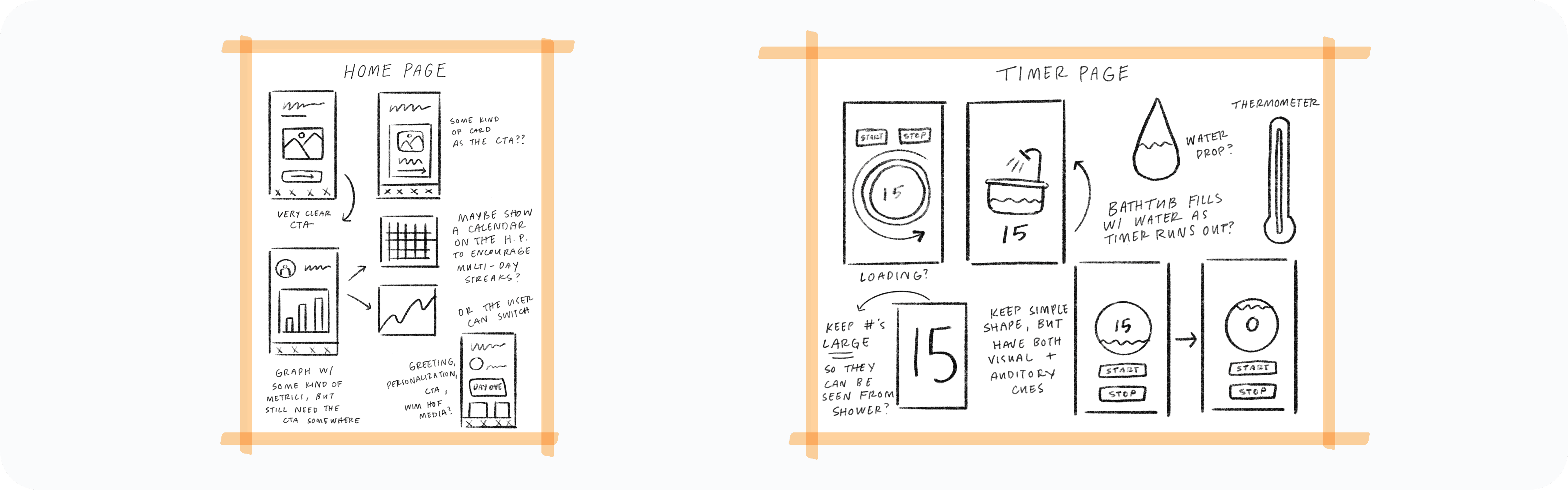
Rapid Prototyping
After mapping our improved user flow we spent time rapidly prototyping a solution. Sketching helped us quickly iterate on the original idea and begin to visualize a solution without sinking time into hi-fidelity screens prematurely.
Styles & Components
Before creating the hi-fidelity prototype we established the product styles and interactive components in Figma to ensure an efficient and consistent design as we moved forward.

Usability Testing
After completing our high fidelity prototype, our team moved our prototype into Maze to get some user feedback. When writing our usability testing script, we broke our prototype flow into short, focused sections to test. Each segment had 1 task and 1 follow-up question for testers to complete.


Test outcomes
Having tested the prototype, we learned new users quickly found the 20-Day Challenge CTA on the home screen and moved through the segment without friction. Our improvements should result in a more digestible and motivating experience for new users and increase the rate of users converting from a free to a premium paid plan.
Three key learnings
1. Creating a clear visual hierarchy is one of the most effective tools for eliminating friction in a user segment.
2. Iteration is greater than perfection when it comes to designing excellent products. Putting a prototype into users hands early for usability testing provides the most valuable insight for where to invest time/energy while designing.
3. Every design decision should be powered by a "why" (user need) in order to create valuable products.
Next steps
While the results from my unmoderated usability test included many positive outcomes, they also presented opportunities for me to learn where further iterations to the experience could be helpful.
If I were to iterate further on the app based on these results, I would concentrate my efforts on iterating the design of the ‘shower timer page' to make it clear how users can advance to the next page once their shower finishes.